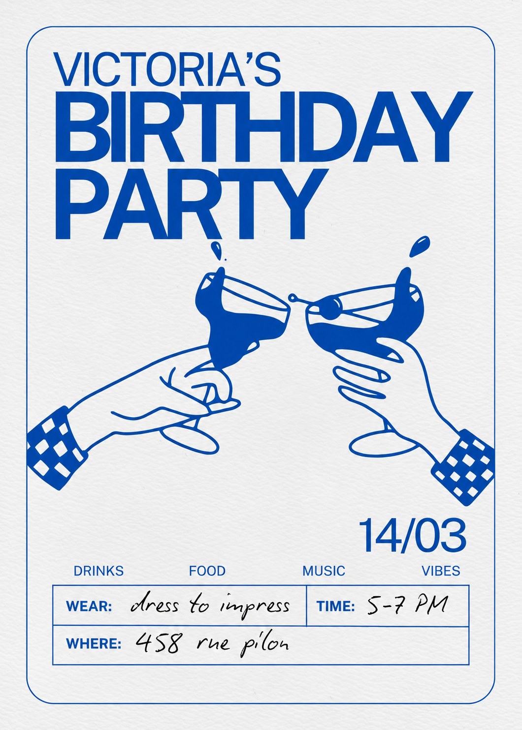
This birthday party poster is a personal project I made for my best friend Victoria’s birthday. I wanted something fun but a little classy, so people would actually want to keep the invite.
The idea behind the birthday party poster
The main picture is two hands clinking glasses. It tells you right away that this is a party. Both hands have checkered cuffs, and the drinks splash out of the glasses. It’s simple, but it gives the poster a lot of energy.
Keeping it to one colour
I used only one colour, a strong royal blue on an off-white paper texture. Because there’s just one colour, the poster looks clean and still stands out. It also makes the drawing and the text feel like they belong together.
Type and layout
For the title, I went with a big, bold sans-serif font. The words Birthday Party take up most of the top half, so you can read them from across the room. Below the drawing, the date sits on its own in large numbers.
At the bottom, I put the details in a small table: what to wear, the time and the address. I wrote those parts in a handwritten style, so it feels personal, like it was filled in by hand. Above the table, four words sum up the night: drinks, food, music and vibes.
What I learned from this birthday party poster
This project showed me that a poster doesn’t need a lot of colours or effects to work. Clear hierarchy, one strong drawing and a bit of personality go a long way. Also, designing for someone I know made it more fun, because I knew exactly what kind of party she wanted.
You can see more of my print work, like my Pigeon Café menu redesign, on my Print Portfolio page.