This menu redesign was a school project where I took the menu for Pigeon Café and gave it a new look. I wanted it to feel friendly and relaxed, like a café you’d actually want to hang out in, while still being easy to read.
The cover
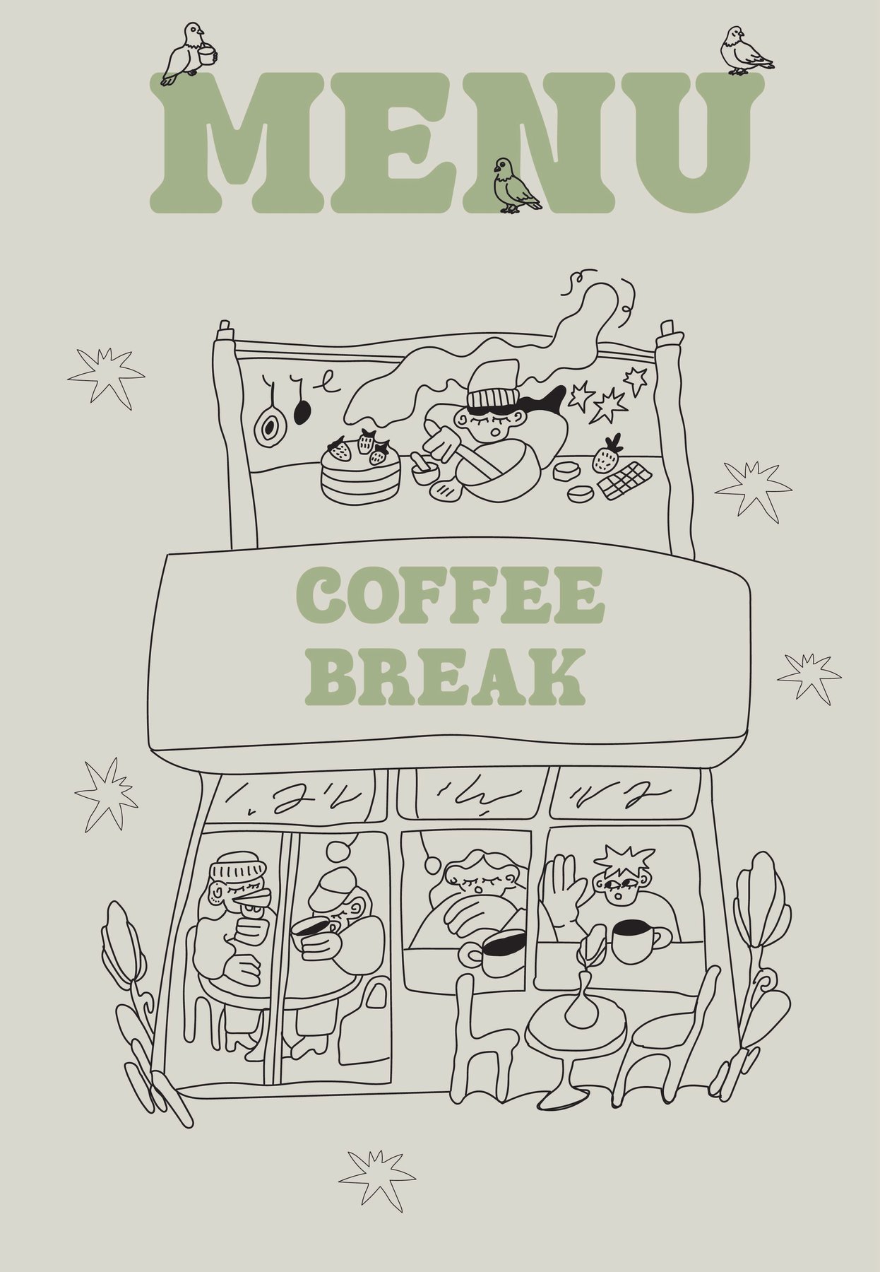
The cover is all about the café itself. There’s a line drawing of the storefront with people inside drinking coffee, someone baking upstairs, and a big Coffee Break sign in the middle. Little pigeons sit on top of the word MENU, which ties back to the café’s name.
The coffee page
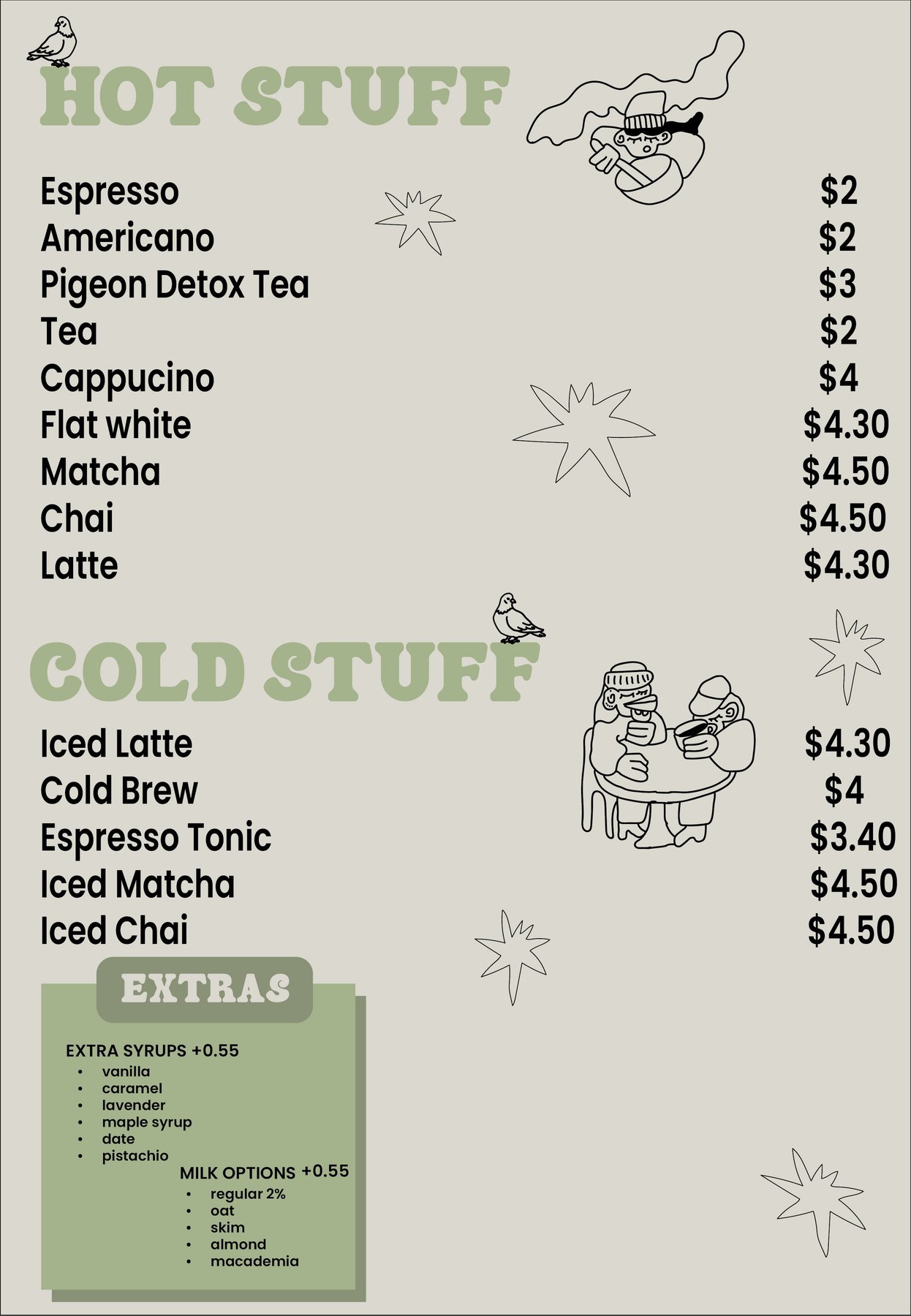
Inside, I split the drinks into three sections: Hot Stuff, Cold Stuff and Extras. Each price lines up on the right so you can scan the list fast. The Extras box at the bottom shows the syrups and milk options, so nobody has to ask at the counter. I also added a few small drawings and stars between the sections so the page doesn’t feel empty, but I kept them light so they never get in the way of the prices.
Colours and type
I kept the colours simple, a soft sage green with an off-white background, so the black line drawings stand out. For the headings I used a bold, rounded font that feels playful, and Poppins for the drink names and prices because it’s clean and easy to read at small sizes.
What the menu redesign taught me
This project showed me how much a menu redesign can change the feel of a place without changing what it sells. Small things like spacing, grouping and a few drawings make the menu more fun to look at and easier to order from.
I made both pages in Adobe Illustrator. You can see more of my work on my Print Portfolio page.